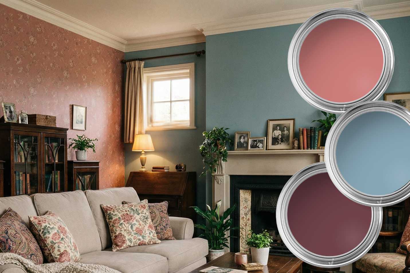
Be inspired by the trend colours for 2027

An invitation to slow down
With Soulful Sage™, Levis is bringing a touch of nature indoors in 2027. This soft, silvery green has been named the Levis Colour of the Year 2027 and reflects a clear interior trend: a growing desire for calm, simplicity and a home where we can escape the constant stream of news and everyday distractions.
Soulful Sage™ (J0. 10.60) provides a calm and versatile base that is easy to combine. A trend colour that doesn’t demand attention, but instead brings a welcome sense of calm, perhaps exactly what we need in 2027.
How to combine this Levis trend colour of 2027?
One of Soulful Sage™’s greatest strengths is its versatility. Levis combines the colour in three different palettes.
- Glow pairs Soulful Sage™ with warm earthy shades such as brown or terracotta.
- Light introduces soft blue-grey tones for a fresh, almost Scandinavian feel.
- Lift combines sage green with soft pink pastels and warm amber accents. Ideal if you want your home to be joyful and playful.
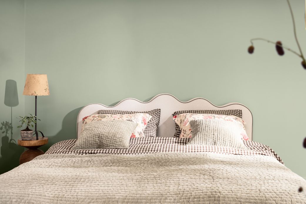
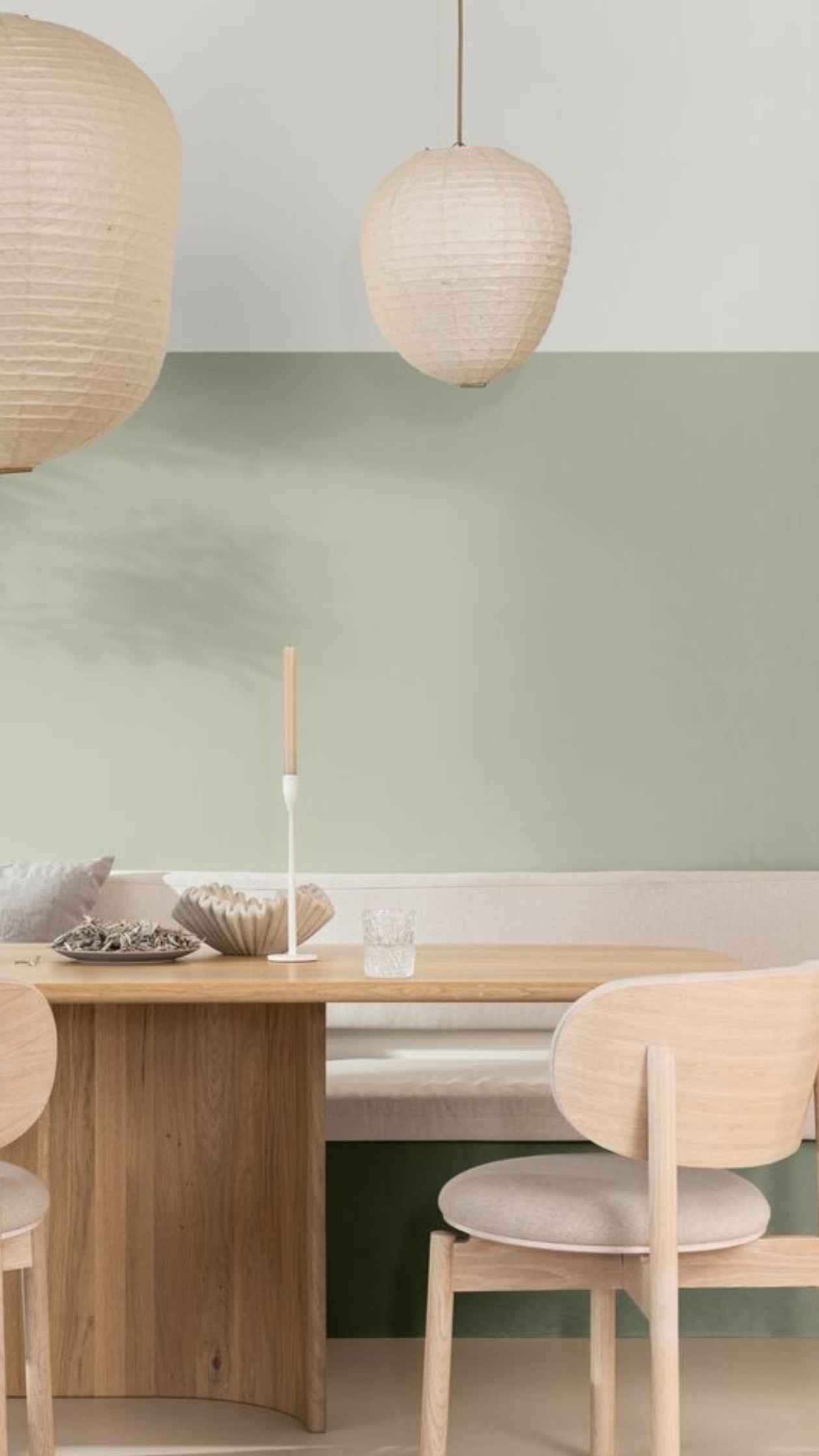
Light colour palette
Combineer de Soulful Sage trendkleur van 2027 met het bijbehorende Light kleurenpalet als je houdt van een minimalistische, zachte uitstraling in huis. Deze lichte tinten creëren een prachtig, natuurlijk lichtspel. Ze doen het uitstekend in de keuken.
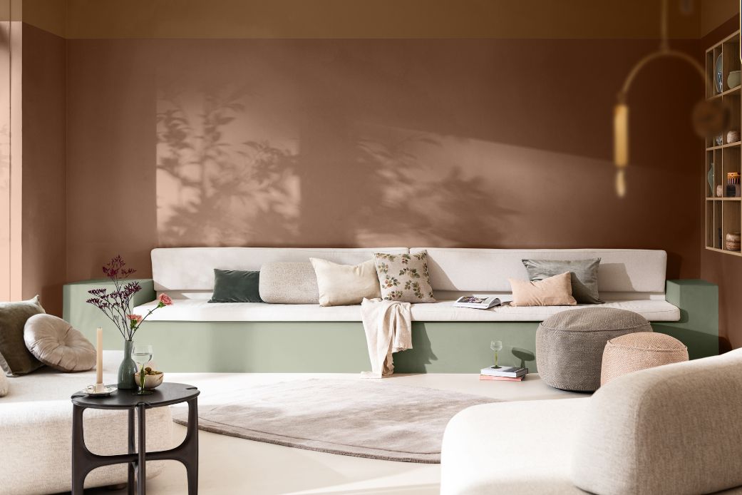
Glow colour palette
Je kunt de AkzoNobel trendkleur van 2027 (Levis, Sikkens, Trimetal) ook prachtig combineren met de warme tinten uit het Glow kleurenpalet. Dit palet bestaat uit klei- en aardetinten. Ze voelen hartverwarmend aan en zorgen voor een knusse sfeer. Will you go with the glow?
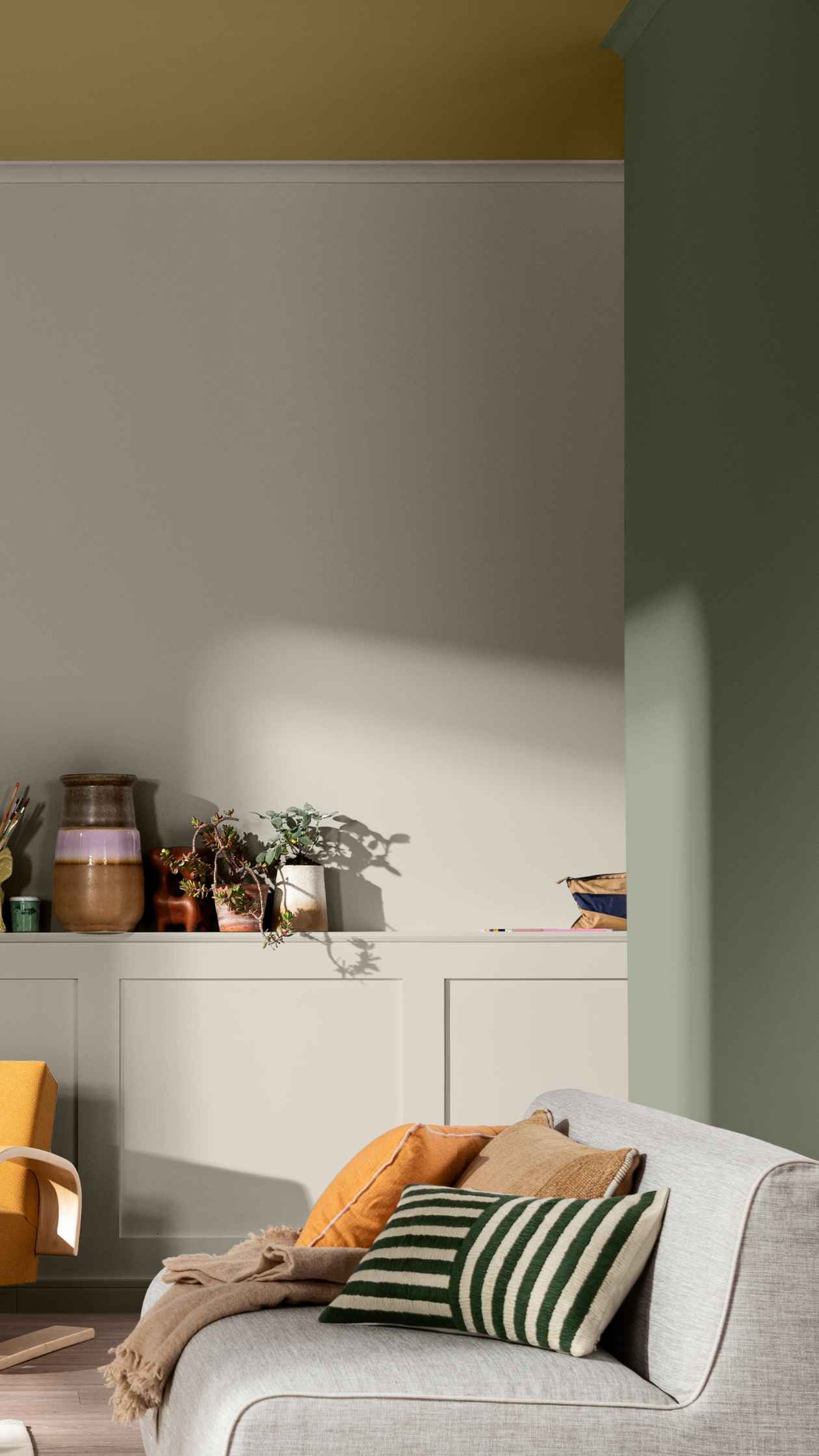
Lift colour palette
Ben je ook fan van de groene verfkleur van 2027, maar wil je de muren toch een persoonlijke touch geven? Met het verrassende Lift kleurenpalet is dat een fluitje van een cent. Je brengt hiermee direct een vrolijke en unieke sfeer in huis. Probeer eens een vleugje roze of geel toe te voegen.
Enjoy the AkzoNobel Trend Colours in Your Favourite Products
👉 Type Soulful Sage™ (J0.10.60) in the “Colour Code” box.

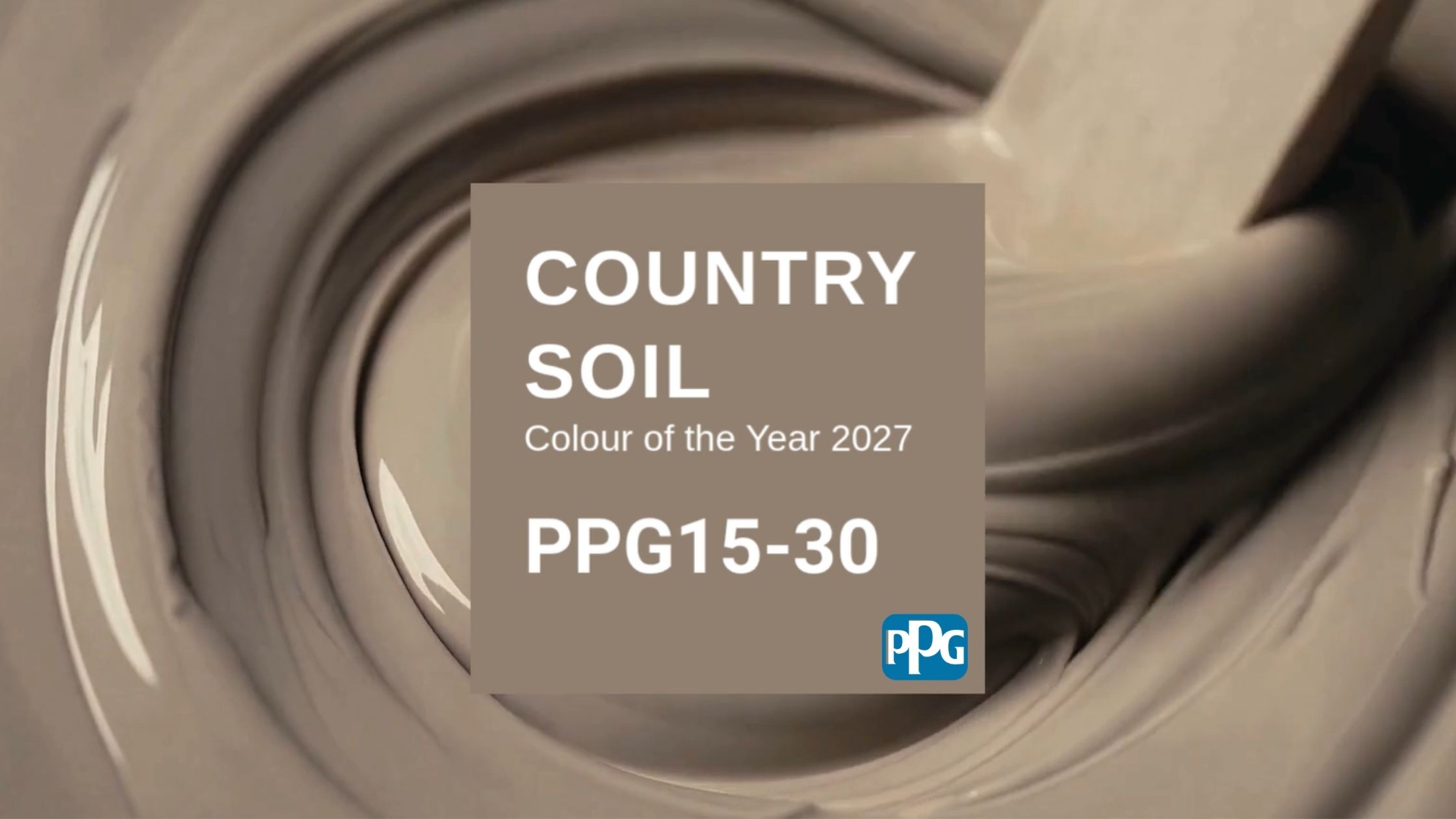
Sigma’s interior colour for 2027 has been revealed: Country Soil (PPG15-30)! This earthy brown paint colour brings you back down to earth. It lends a sense of stability, continuity and solid ground beneath your feet. In fast-moving, sometimes chaotic times, Country Soil helps you feel grounded again. It’s a colour you can build on endlessly. To help you get started, Sigma has created three colour palettes: Solid Ground, Quiet Zone and Life Shared. Every colour in these palettes pairs beautifully with Country Soil.
How do you combine Country Soil, Sigma’s 2027 trend colour?
The 60-30-10 rule helps you create a balanced colour scheme: use one main colour for around 60% of the room, a second colour for 30%, and an accent colour for the remaining 10%. In a living or dining room, Country Soil can take that second role. Just one wall adds depth, while an off-white such as Linen Ruffle or a light brown shade such as Spanish Cotton or In the Saddle forms the base.
In the bedroom, Country Soil can confidently take centre stage. Used on several walls, it creates a warm, comforting atmosphere.
Download our overview of all the trend colours and see at a glance which combinations work for you.
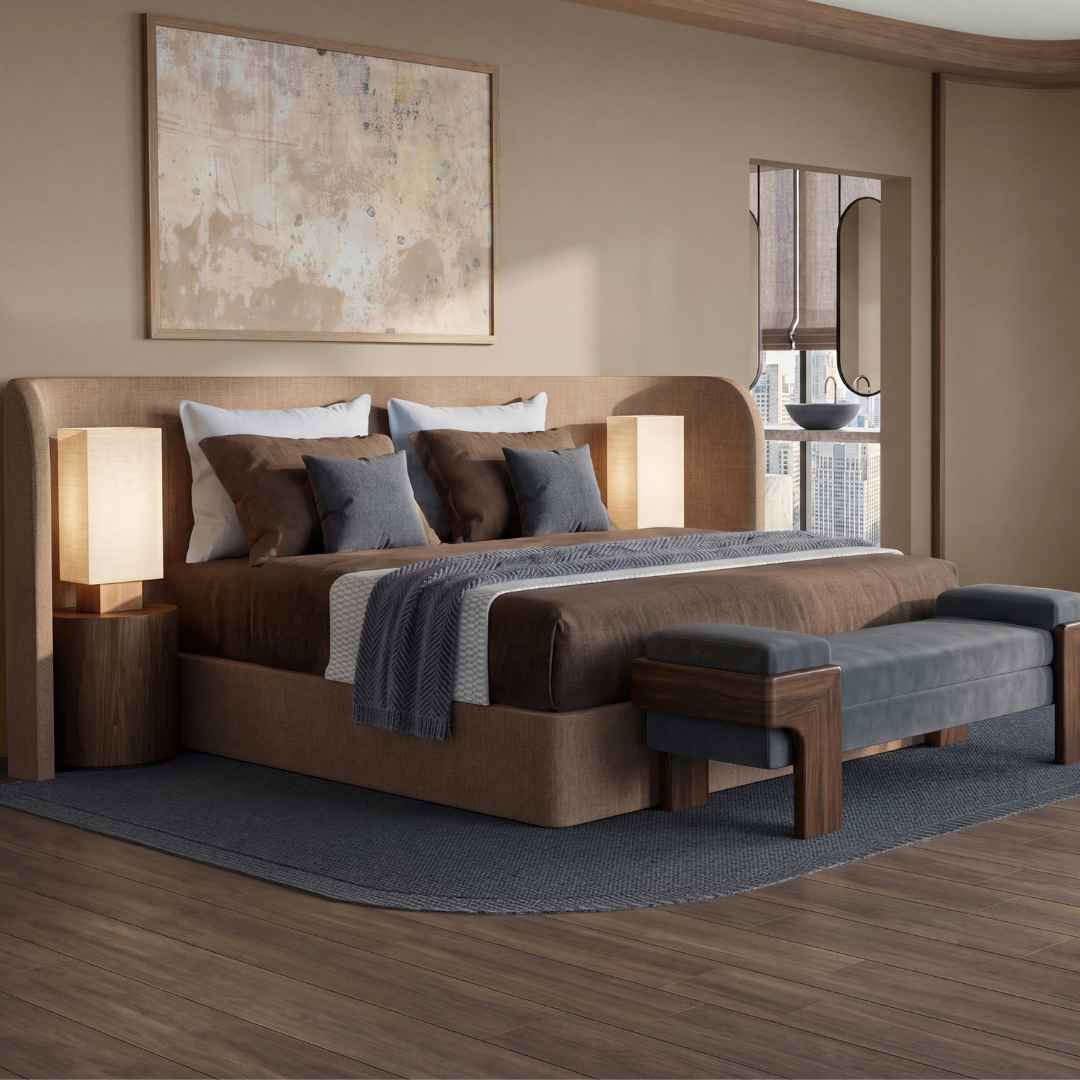
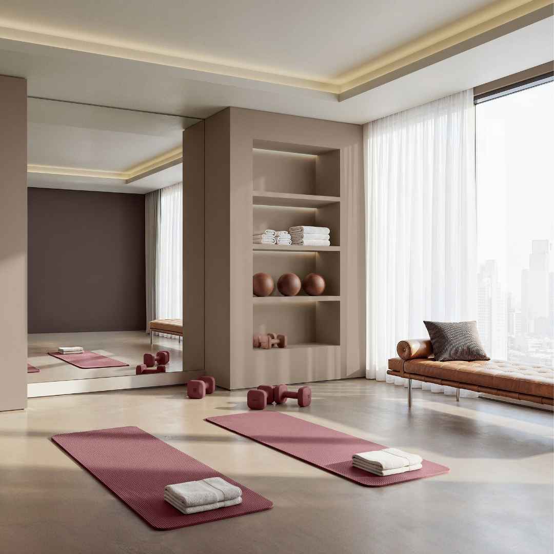
Solid Ground palette
These days, true luxury is less about an abundance of shine and more about a deep connection with nature. This palette introduces the natural shades of earth and stone, from greys and beiges to mossy greens.
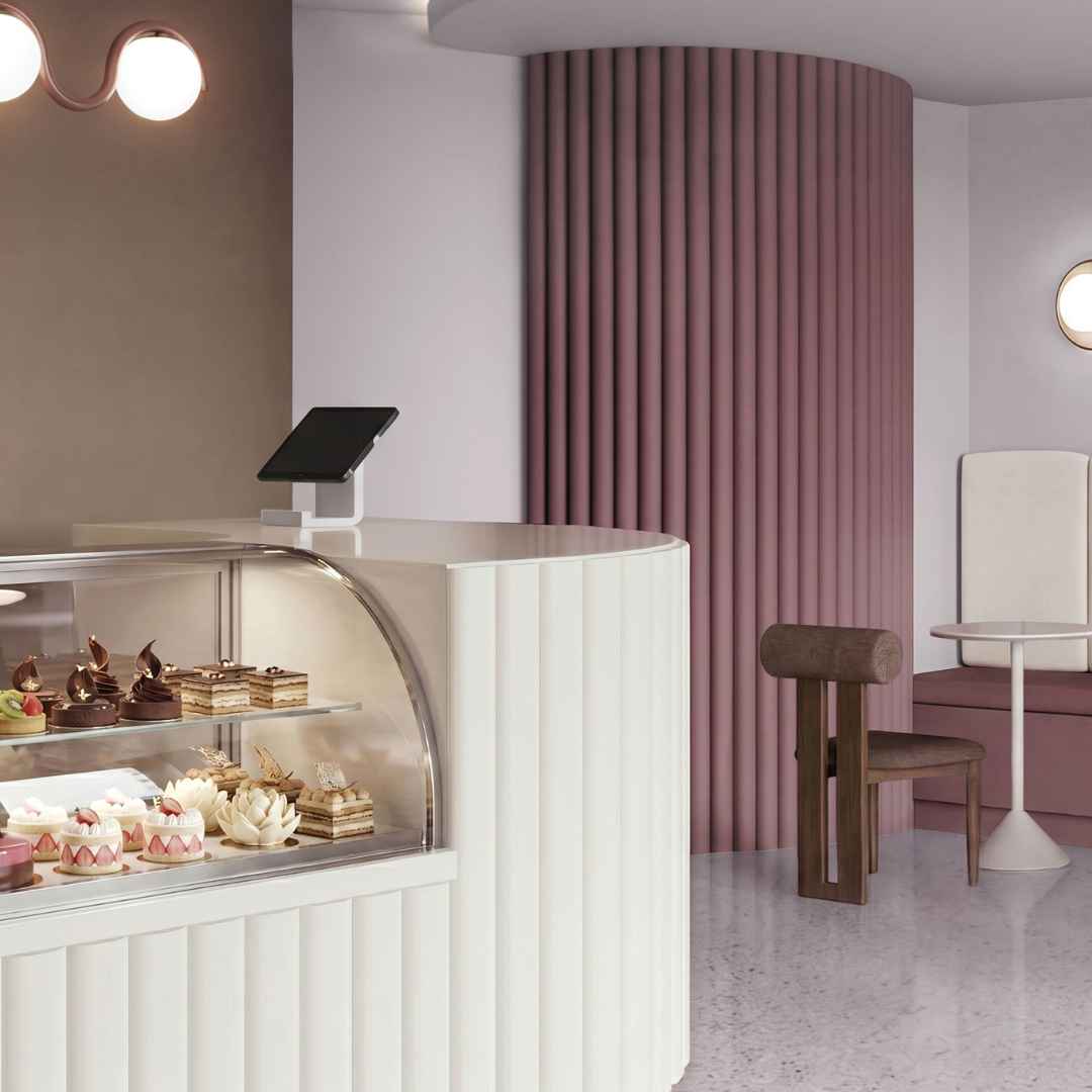
Quiet Zone palette
Do you love a serene interior where your mind can unwind? The soft pinks and creamy whites of the Quiet Zone palette are sure to appeal. Here, luxury is simply the pleasure of enjoying the quiet.
Life Shared palette
Relationships, togetherness and wellbeing matter more than ever. This final palette celebrates the things that fill our hearts. Think uplifting retro colours that give you energy, such as mustard yellow and sky blue. It captures the joy of being together.
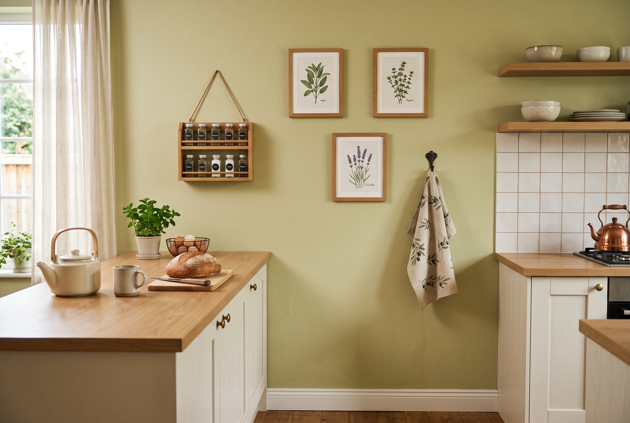
Schnappi is Tintrio's Colour of the Year 2027
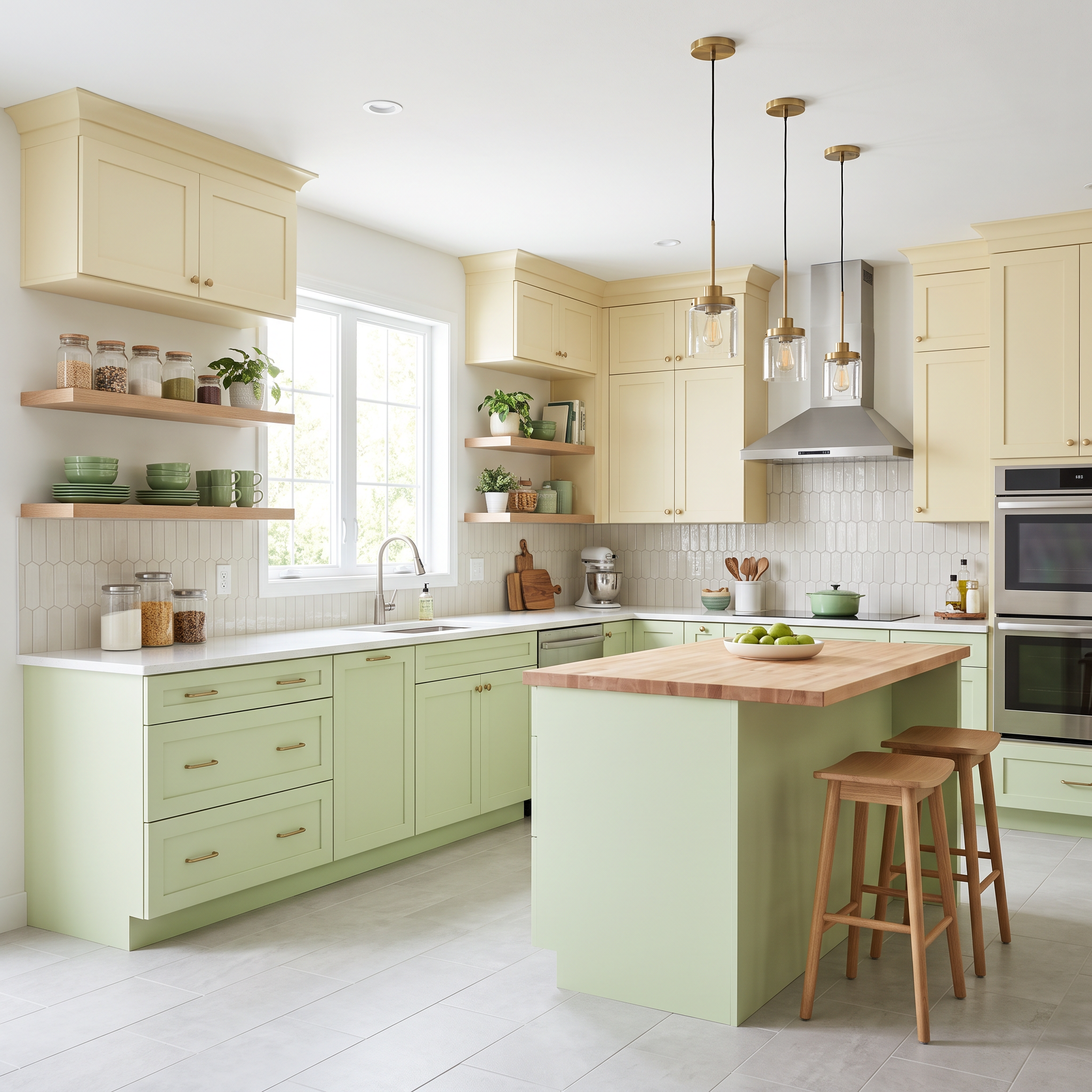
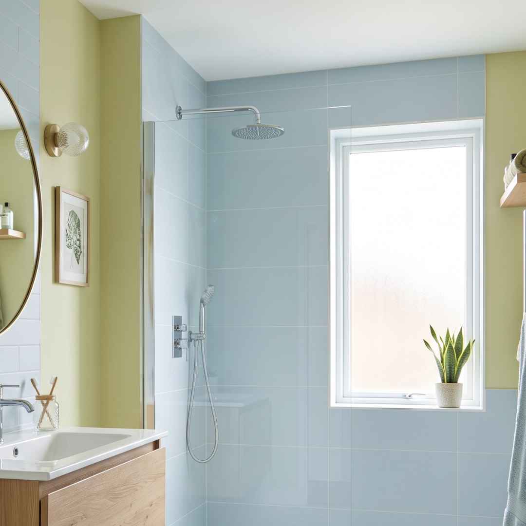
The votes are in, and you have spoken: Schnappi is officially Tintrio's Colour of the Year 2027. The colour brings exactly what we could use after an exceptionally hot summer: freshness and a touch of nostalgia. After weeks of heatwaves, dry landschapes and wildfires, this light yellow-green shade feels almost like finding a cool spot in the shade on a hot summer day.
The name may sound familiar too. Schnappi, the little crocodile, was once almost impossible to get out of your head. This colour has that same playful charm. Perfect for anyone looking to bring a little more lightness and optimism into their home in 2027.
The other nostalgic nominees for Tintrio's Tint of 2027
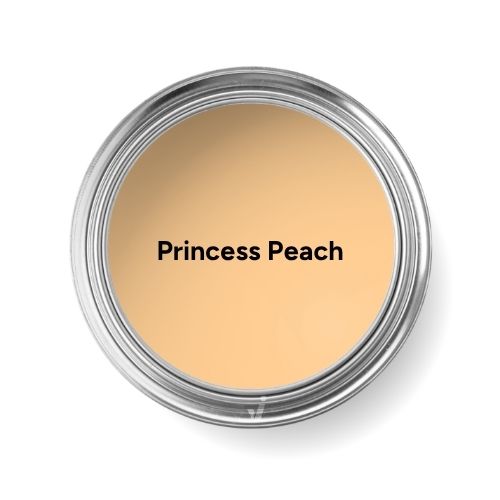
Alongside Schnappi, two other eye-catching colours were in the running to become Tintrio's Colour of the Year 2027. Princess Peach, a soft peachy orange, finished in a strong second place and came remarkably close to Schappi.
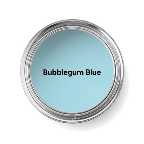
The second Bubblegum's Blue is a bit more daring, but it was also a strong contender. Refreshing.
Although they didn't take the top spot, both shades clearly show the colourful directions that will continue to inspire in 2027: playful on the one hand, fresh and uplifting on the other.
How to combine this Tintrio tint of the year 2027?
Curious to find out which other shades are featured in our own Tintrio trend colour palette? Download our overview and see how you can combine Schnappi. You’ll get the idea straight away.
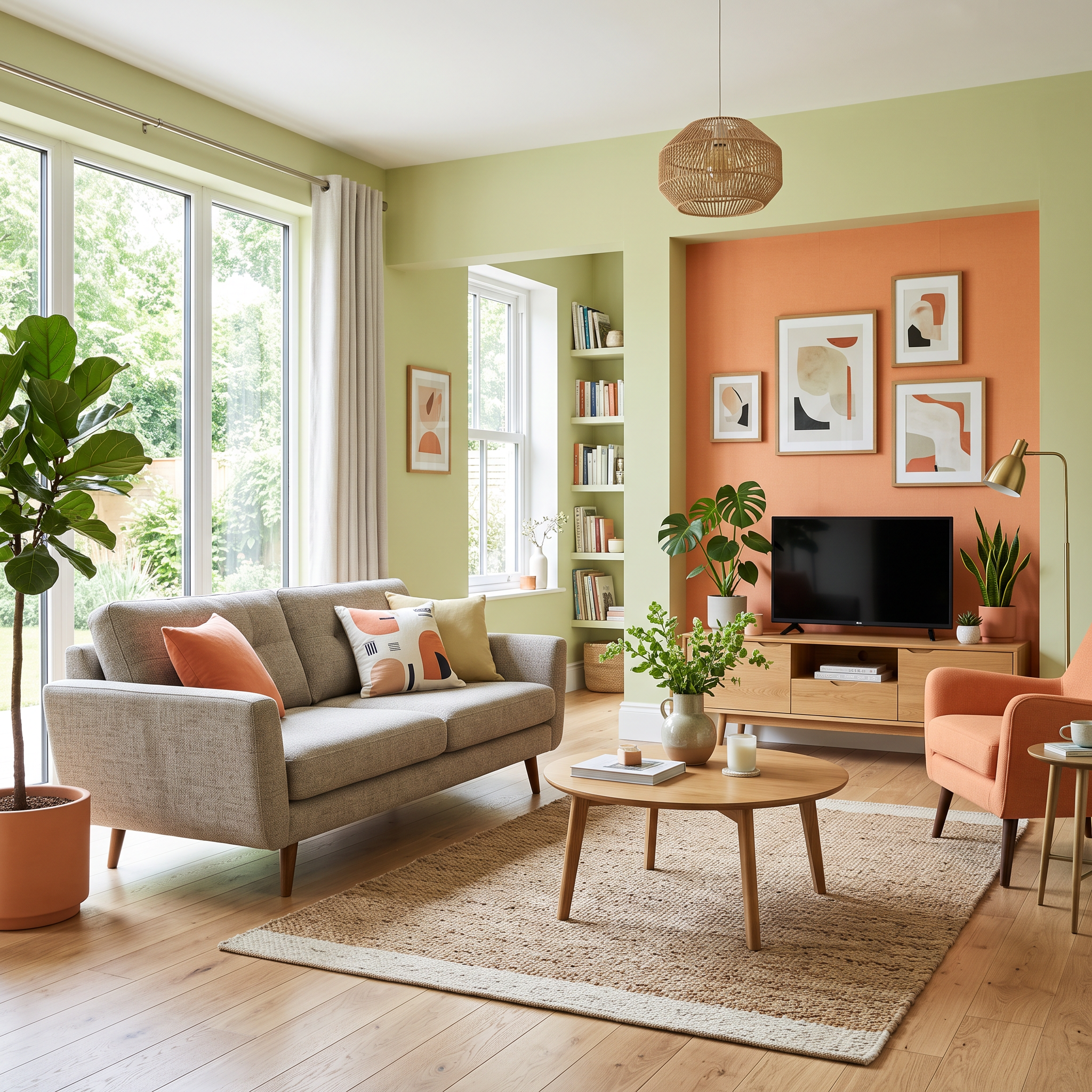
Other Trend Colours for 2027
Looking for even more colour inspiration? Discover the Colours of the Year chosen by other leading paint brands for 2027.
While we can't mix these exact shades, we can select a close colour match for each one. That way, you can still bring the latest colour trends into your home.
Behr: Grounded
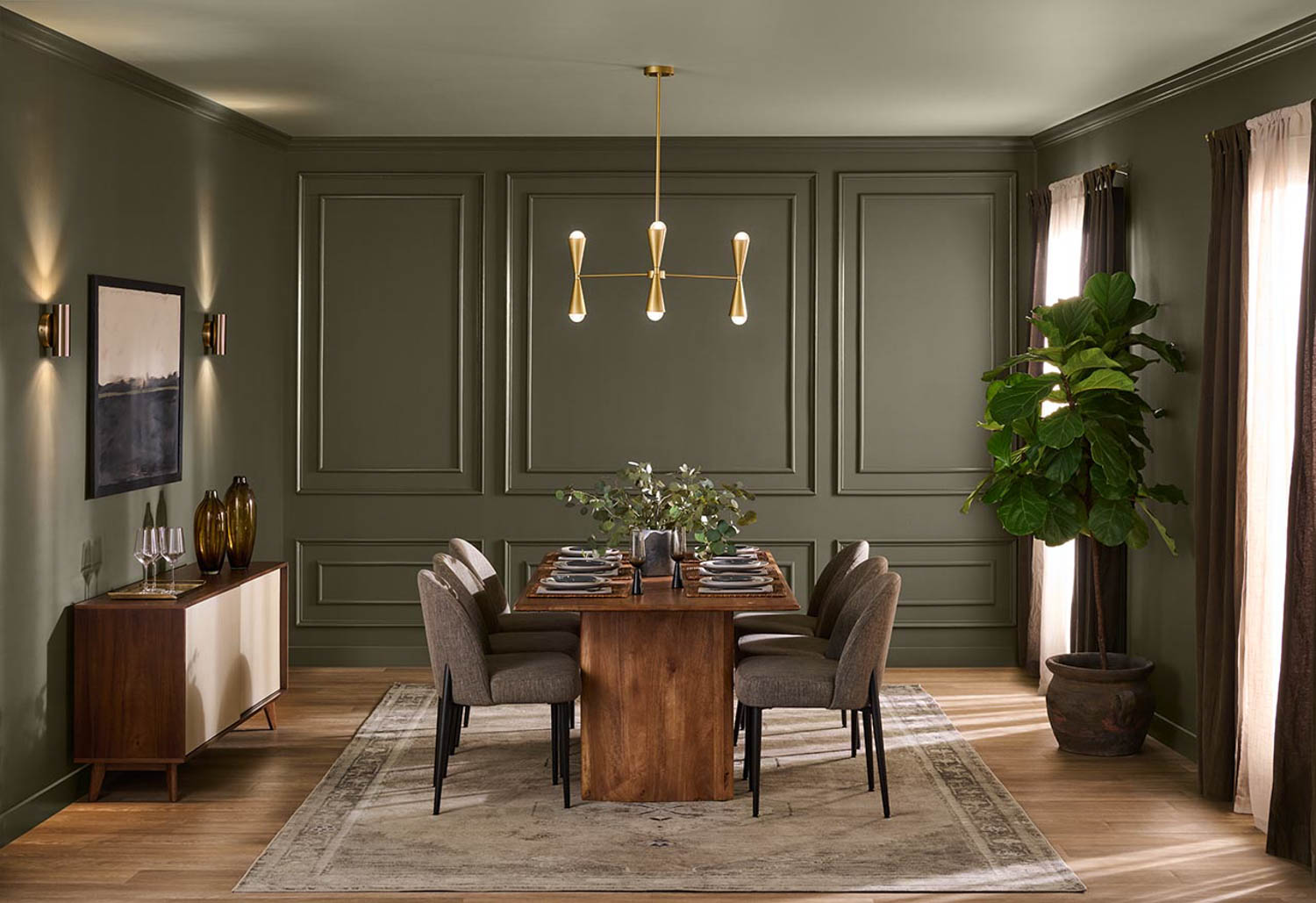
Behr has chosen Grounded as its Colour of the Year for 2027: a deep, earthy olive green that brings a sense of calm and warmth into your home. Its blend of mossy green and subtle brown undertones gives the colour character without feeling overpowering. A natural shade that makes your interior feel a little more grounded - quite literally.
Tintrio alternative:
Valspar: Cottage Door
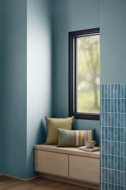
Valspar opens the door to a calmer home with Cottage Door. This soft blue has warm undertones that make it feel cosy rather than cool. This shade is also surprisingly versatile. Pair it with warm whites and natural materials for a soft, timeless look. A lovely choice if you want to introduce colour into your interior while keeping the overall look calm and balanced.
Tintrio alternative:
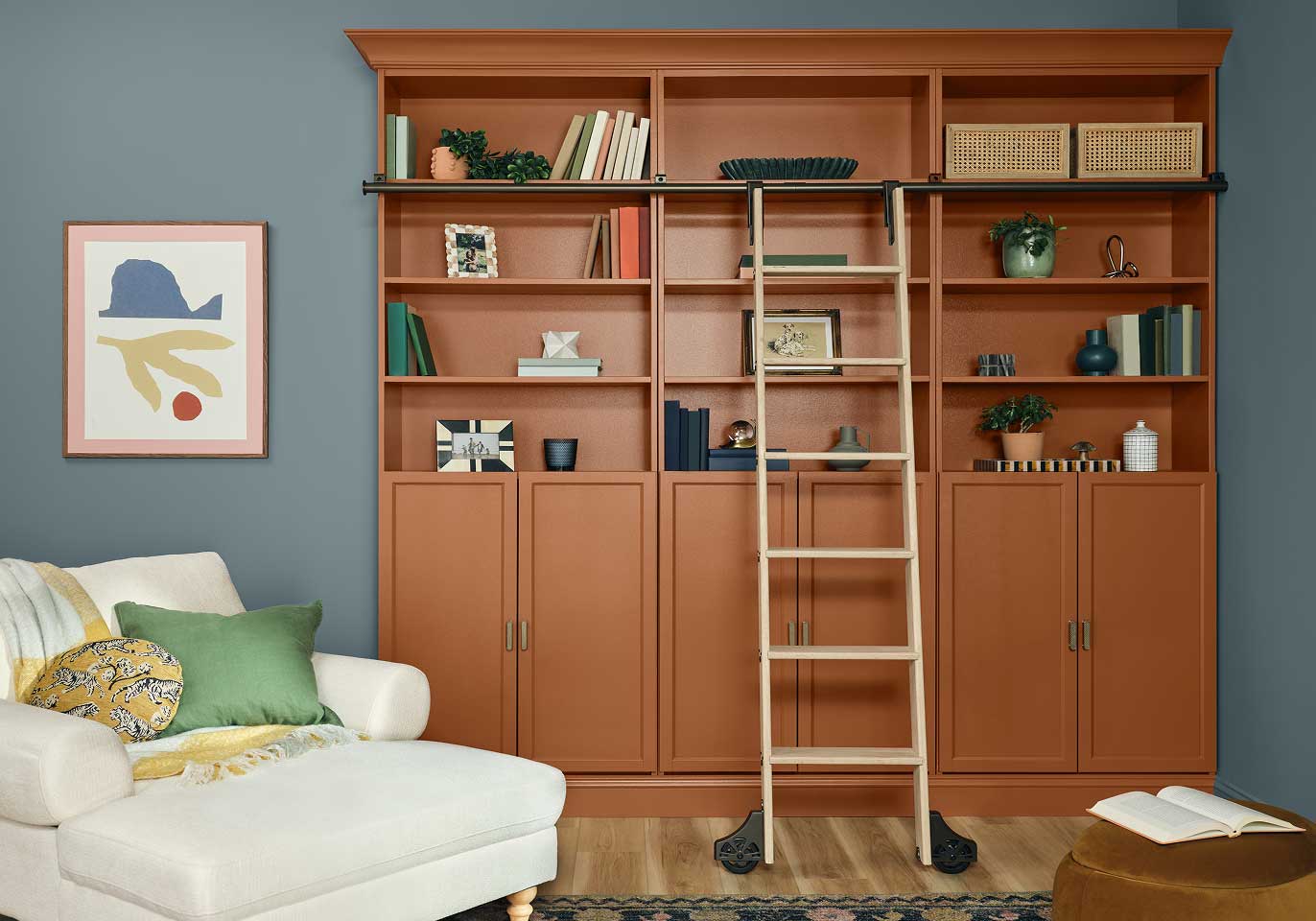
Dutch Boy Paints: Deep Rooted
Dutch Boy Paints welcomes 2027 with Deep Rooted: a warm, earthy orange reminiscent of terracotta and sun-baked clay. This inviting shade brings warmth and character into the home while creating a natural atmosphere. Pair Deep Rooted with soft neutrals for a harmonious look, or combine it with greens and blues for a fresh contrast.
Tintrio alternative:
Recent blogs
Can't get enough of the trends in paint land? Then be sure to check out our recent blog posts with even more interior design trends.